Have you ever wondered why some websites excel at grabbing visitors’ attention and turning them into customers? The secret lies in leveraging the well-established F-shaped pattern of user experience.
By understanding this pattern, website owners can craft engaging online experiences that pique the interest of their target audience and drive conversions.
In this article, we’ll explore how businesses can utilize the F-shaped layout to engage, capture, and convert website visitors into loyal customers. We’ll discuss what the F pattern is, how it functions, and why it’s effective in boosting conversions. Finally, we’ll share practical tips to ensure your website maximizes this powerful web design strategy.
What Is the F-Shape?
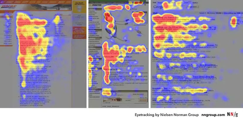
The F pattern is a popular user experience design framework that helps website owners effectively engage visitors, capture their attention, and convert them into customers. It consists of three main elements: scanning, reading, and navigating.
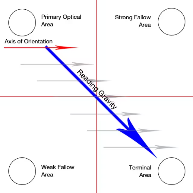
Scanning: The F shape prompts users to quickly and efficiently scan for relevant information. Key content is typically positioned in the top left corner of the page, as this is where visitors’ eyes are naturally drawn first.

After scanning the page, users delve into more detailed content further down, reading a few lines at a time before continuing. The F shape also guides visitors to navigate the website logically, making it easier to find important information quickly.
Why Are F-Shape Web Pages Effective?
The F pattern is an effective design structure because it enhances user engagement, captures attention, and drives conversions. It creates a clear visual hierarchy, guiding visitors to quickly find relevant information positioned in the top left corner.
This design allows users to get an overview of the content without excessive searching. If they find what they need, they’re likely to read more in-depth further down the page.
Moreover, the logical navigation structure helps users easily locate information, ensuring accessibility throughout the site. By leveraging this powerful design tool, businesses can improve the online experience for visitors, ultimately boosting conversions and revenue growth.
Designing for the F-Shaped Pattern
To effectively design for the F pattern, it’s crucial to understand how readers scan a website and absorb information. By following this pattern, businesses can help visitors quickly access essential content, guiding them through the page and enhancing engagement.
When implementing the F-shaped design, optimizing the layout and structure is key for easy scanning.
Prominently place headlines at the top of each section, and use subheadings with bold fonts or strong visual cues throughout. Additionally, incorporate short, attention-grabbing sentences near the top of each section to quickly capture users’ interest.

It’s essential to incorporate visual cues like colors and icons throughout the page to direct readers’ attention to key content elements. For instance, using color can make headlines more prominent, while icons next to calls to action can effectively draw attention.
Additionally, strategically placed images can help clarify ideas and concepts, guiding users’ eyes across the page.
By leveraging these design elements and optimizing content layout, businesses can utilize the F pattern to engage their target audience and boost conversions.
With thoughtful implementation of this user experience pattern, companies can expect more engaged visitors who stay longer on their sites and are more likely to convert into paying customers over time.
Mobile Responsiveness and the F Pattern
When designing for the F layout, it’s crucial to consider how content will appear on mobile devices. With the rise of mobile browsing, optimizing your website for smartphones and tablets is essential for a positive user experience.
A key approach to achieving this is through responsive design, which ensures that users can access the same content regardless of their device while still engaging with it effectively.
Designers should focus on font size and line length, as well as how elements like images and menus will adapt to various screen sizes. Additionally, links and buttons should be easy to click on any device, with enough space between them to prevent accidental taps.

Moreover, when designing for mobile devices using the F pattern, prioritizing usability is essential. Content should be concise yet meaningful, allowing readers to quickly scan and absorb information.
Incorporating icons or images can also enhance engagement by drawing attention along the horizontal lines of the page.
By following these best practices for mobile-friendly content and design, businesses can create an optimal user experience that effectively utilizes the F layout across various devices. This combination of design elements can lead to more engaged visitors who stay longer on websites and are more likely to convert into paying customers over time.
Conclusion
In summary, utilizing the F-shaped layout for content design and optimization allows businesses to create an engaging online experience for website visitors, ultimately boosting conversions.
By structuring the layout for quick scanning, crafting compelling headlines and opening sentences, incorporating visual cues, designing mobile-friendly elements, and ensuring content is easily readable, businesses can effectively leverage the F pattern.
Implementing these design principles and content strategies will likely lead to more engaged visitors who spend more time on the site and are more inclined to convert into paying customers over time.


