Explore how branding by color shapes customer perceptions and emotions. Learn to select colors that enhance your brand identity and attract your audience.

Why Is a Brand Color Palette Important?
A strong brand image and identity are crucial for any successful business, and one of the most effective ways to establish a recognizable brand personality is through color. Companies like Coca-Cola, McDonald’s, and Starbucks demonstrate how powerful color can be in branding. But how many colors should a brand use?
The answer varies based on factors such as business type, goals, target audience, and budget. Some brands may choose one or two primary colors for consistent use, while others might incorporate a broader palette.
When selecting your brand’s colors, it’s vital to consider how different shades influence consumer perception and behavior. The colors should also reflect your brand’s personality and align with your overall goals and desired customer perception.
Color is a key element in branding, as it can help your products stand out and make your brand memorable. However, there’s ongoing debate about the ideal number of colors for effective brand design.
This article explores the importance of color branding, how to choose appropriate colors, and the optimal number of colors for your branding strategy.
Benefits of Branding with Color
Color significantly impacts branding by evoking emotions and differentiating your products from competitors. Selecting vibrant colors that resonate with your offerings creates a lasting visual impression, instilling a sense of optimism in customers. Additionally, colors can help distinguish various products or services within a single brand, making it easier for customers to find what they need.
Choosing colors that align with your brand’s personality enhances emotional connections with customers. Effective color branding can lead to numerous benefits, including increased recognition, memorability, and differentiation among products. A consistent color scheme across all marketing materials fosters a cohesive brand identity, building customer trust and reinforcing your message.
Colors can also highlight key elements of your branding strategy, aiding in the retention of important messages. Furthermore, they can create associations between related products, simplifying the customer journey.

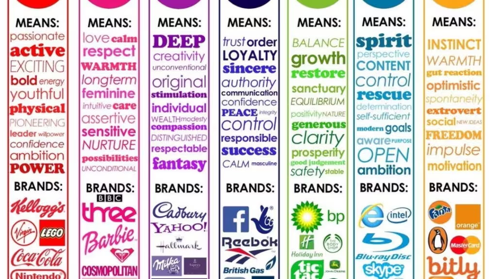
When crafting a color-based branding strategy, it’s crucial to consider the psychology of color. Different shades evoke various emotions and can help target specific audiences effectively. For instance, warmer colors like reds and oranges are often linked to energy and passion, while cooler blues may evoke feelings of trust and serenity.
Choosing the right colors for your brand is vital for establishing a visual identity that customers can easily recognize and remember. Utilizing multiple colors can diversify your branding while maintaining consistency with your core message.
However, it’s important not to overcomplicate your palette. Using too many hues can create confusion or convey mixed messages about your company’s values and goals. Instead, carefully select a few primary colors that represent your brand values, ensuring that any additional accent colors complement rather than distract from your overall design intent.
Colors and Their Qualities
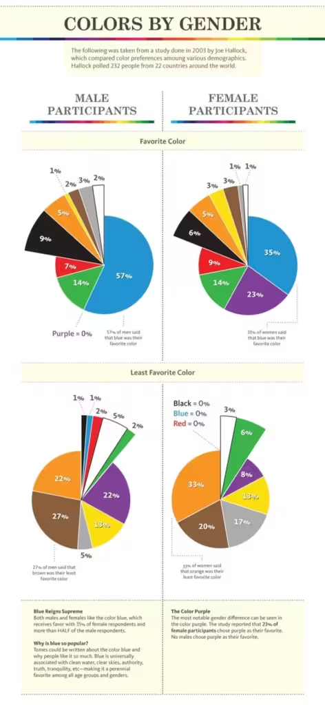
How people perceive colors can be subjective and influenced by cultural backgrounds and personal experiences. Understanding your target audience is crucial before selecting colors for your branding; testing various options can help ensure you make the right choice.
Here’s a brief overview of what different colors typically convey:
- Blue: Honesty, competence, trustworthiness, reliability
- Red: Attraction, excitement, anger, love
- Green: Money, health, balance, knowledge
- Purple: Royalty, respect, creativity, mystery
- White: Purity, space, neutrality, innocence
- Black: Seriousness, sophistication, intelligence
- Yellow: Happiness, youth, adventure
Conducting research on your target customers is essential for informed decision-making when choosing branding colors. If you’re unsure which colors to select, consider hiring a branding design firm to guide you in making the best choices.

Choosing Colors for Your Business
Selecting the right branding color requires careful consideration and effort. First, you need to clarify the message you want to convey to your customers. Understanding your brand identity and personality traits is essential before settling on a primary brand color. Once you have this foundation, you can choose a color that effectively evokes the desired emotions in your audience.
It’s important to know how you want people to perceive your business. If you’re unclear on this, take the time to define it before moving forward.
Color combinations and complementary shades are also significant. While a single color may evoke a specific emotion, combining it with another can alter that effect. As you add more colors, the complexity of your branding increases. A solid grasp of color psychology is crucial for making informed choices. This is why many businesses opt to work with branding and design agencies to navigate the intricacies of color selection.

When choosing the right colors for your brand, several key factors should guide your decisions:
- Target Audience: Consider who you aim to reach with your branding. Different demographics have varying emotional responses to colors, so understanding their preferences can help you select a palette that resonates.
- Budget: The cost of colors can vary significantly depending on the medium. If you’re working within a tight budget for printed materials or web designs, you may need to limit the number of colors in your branding scheme.
- Brand Consistency: Consistency across all marketing materials is vital for building an effective brand identity. New colors should complement or subtly contrast existing primary colors to avoid confusion.
Ultimately, the number of colors in your brand’s visual identity will depend on your goals and target audience. Some brands may choose one or two primary colors for uniformity, while others may incorporate multiple hues to differentiate products or services.
How Many Colors Are Enough for a Brand?
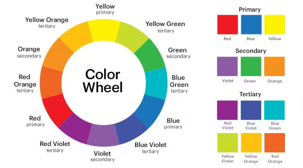
Understanding the roles of primary, tertiary, and complementary colors is crucial when selecting your brand’s palette. Typically, two to three primary colors form a solid foundation for your brand identity. These colors should reflect your core values and appeal to your target audience. For example, a tech company might choose blue to convey trust and innovation, while a health brand might opt for green to symbolize growth and harmony.
Incorporating one or two tertiary colors can add complexity and depth to your palette, allowing for versatility across various platforms and marketing materials. Tertiary colors, made by mixing primary and secondary shades, create a more nuanced and sophisticated look. These additional hues can highlight specific design elements or enhance the overall visual experience, making your branding more dynamic and engaging.

How to Keep Your Brand Color Palette Simple Yet Effective
Using more than two corporate colors can disrupt the cohesive look of your materials. For example, if you have five main colors, you might use colors 1 and 2 on your business card, colors 2, 3, and 4 on your brochure, and colors 2, 4, and 5 on your website. This inconsistency can undermine your brand’s visual identity.
A consistent visual identity is essential for building brand recognition. Customers often need several exposures to your brand before deciding to purchase. Make it easy for them to connect with your brand by ensuring visual consistency across all touchpoints.

If you feel limited by using just a couple of colors, consider designating 1 or 2 as primary colors and 2 to 4 as secondary colors. For example, Airbnb uses red as its primary color in the logo, complemented by four secondary colors, including two neutral grays, as accents in their marketing materials.
Use your primary colors for smaller applications, like business cards, while incorporating additional colors in other branding materials, such as websites, product packaging, and social media posts, to maintain cohesion. When adding colors, specify each one by selecting the exact PMS, RGB, or CMYK values and using them consistently. Typically, a designer will choose a Pantone (PMS) color along with its CMYK and RGB equivalents.
Common Mistakes in Color Branding
One major mistake is failing to consider the target audience and their cultural backgrounds. For instance, a company might choose a bright red for its branding, thinking it universally conveys excitement and energy. However, in some Asian cultures, red symbolizes luck and prosperity instead of passion and urgency. This oversight can create confusion or even provoke negative reactions from potential customers.
Another error is neglecting to research the psychology of colors and their effects on consumer behavior. Each color carries specific emotions and associations that can either align with or contradict a brand’s message. For example, while yellow can effectively convey positivity and happiness, if misused, it may also be associated with caution or deceit. Understanding these nuances is crucial for successful color branding.

Consistency is vital in color branding. Inconsistent color use across different platforms can dilute a brand’s message and make it less recognizable to customers. For instance, if a company uses varying shades of blue on its website and social media, it may confuse consumers and hinder the establishment of a clear brand identity.
To avoid these pitfalls, conduct thorough research and gather feedback from a diverse group of individuals before finalizing your brand colors. This process helps ensure that your chosen colors resonate with your target audience’s preferences and cultural backgrounds. Additionally, understanding the psychology of colors and their impact on consumer behavior is crucial. Lastly, maintaining consistency in color usage across all platforms is essential for building a strong and recognizable brand identity.
Conclusion
Choosing branding colors is a critical decision; it’s not as simple as picking any colors you like. You should rely on color theory and psychology to make informed choices. Your target customers need to connect with your selected color scheme, and the psychology behind those colors should align with your brand identity.
The colors you choose can either attract customers to your business or deter them. It’s essential to ensure that your color choices are effective. If you’re unsure, consider partnering with a branding and design agency. This can help you avoid mistakes and save valuable time.


