Design principles provide a strong foundation for developing effective solutions through innovative design patterns, advanced interaction models, and evolving standards. With the right principles in place, you can confidently chart your path forward. Your company’s design principles should highlight what sets your product apart, how it resonates with users, and what matters most to both your business and your customers.
Apple’s Human Interface Guidelines and Google’s Material Design Guidelines are among the most renowned and insightful design principles to learn from. Below, we’ve compiled a collection of design principles used by some of the most successful and innovative companies in the world.
Airbnb
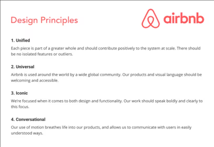
Unified: Every element should contribute to the overall system, ensuring that there are no isolated features or outliers.
Universal: Designed for a global audience, our products and visual language must be welcoming and accessible to all.
Iconic: We prioritize clarity and impact in both design and functionality, ensuring our work communicates effectively.
Conversational: Motion adds life to our products, enabling clear and engaging communication with users.
Read More: Design Principles Airbnb “Building a Visual Language Behind the scenes of our new design system’’
Airbnb “Designing For Trust”
Apple
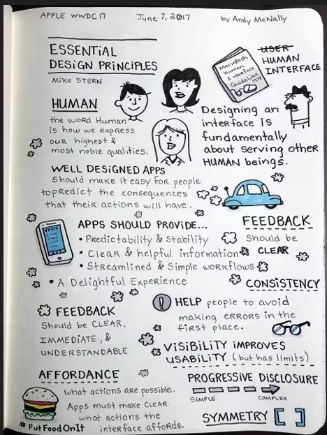
Aesthetic Integrity: This principle emphasizes how well an app’s design and behavior align with its functionality. For instance, an app designed for serious tasks can enhance focus by using subtle graphics, standard controls, and predictable interactions.
Consistency: Familiar standards and paradigms should be used through system-provided interface elements, recognizable icons, uniform text styles, and consistent terminology, ensuring that features and behaviors align with user expectations.
Direct Manipulation: Engaging users through direct manipulation of on-screen content fosters understanding. This includes actions like rotating the device or using gestures to interact with content.
Metaphors: Users learn more effectively when virtual objects and actions within an app mirror familiar real-world experiences, whether physical or digital.
User Control: The best apps strike a balance between empowering users and preventing unwanted outcomes. Apps should maintain familiarity in interactive elements, confirm destructive actions, and allow easy cancellation of operations, even during progress.
Read More: Apple iOS Human Design Guidelines
Google Material Design
Material is the Metaphor: A material metaphor serves as a cohesive framework that rationalizes space and movement. Key principles of light, surface, and motion convey how objects interact and exist in relation to one another. Realistic lighting highlights seams, defines spaces, and indicates moving parts.
Bold, Graphic, Intentional: Drawing from the principles of print design—typography, grids, space, scale, color, and imagery—these elements do more than create visual appeal; they establish hierarchy, meaning, and focus. Thoughtful color choices, edge-to-edge imagery, large typography, and intentional white space combine to create a bold interface that immerses users in the experience.
User Actions: Focusing on user actions makes core functionalities clear and provides navigational cues for users.
Motion Provides Meaning: Motion enhances the user experience by emphasizing the user’s role as the primary actor. Key user actions become inflection points that trigger motion, transforming the entire design.
Read More: Google Material Design
Medium
Direction over Choice: Prioritize guidance over layout, typography, and color choices. Medium emphasizes directing users’ attention towards writing, minimizing distractions from excessive options.
Appropriate over Consistent: While this may seem counterintuitive, Medium values appropriateness across devices over strict consistency. Flexibility allows for better alignment with the specific OS, device, or context.
Evolving over Finalized: Medium embraces an evolving approach, allowing users to share drafts, write responses, and leave notes. This antifragile content is designed to improve and adapt over time through user interaction.
Read More: Medium “Creating useful design principles”
Universal: Design must be inclusive, catering to diverse cultures, languages, devices, and life stages. Focus on creating products that serve 90% of users, even if it means sacrificing features that cater to a minority, especially in the short term.
Human: Central to Facebook’s mission is the focus on people. The voice and visual style take a backseat to highlight users’ voices, faces, and expressions.
Clean: Our visual style is minimal and understated, providing a blank canvas for user interaction. A well-lit, uncluttered space fosters participation and encourages honest, transparent communication.
Consistent: Use design patterns to enhance usability. By ensuring similar elements are expressed consistently, interactions can build trust and communicate effectively. Emphasize reduction and reuse over unnecessary redesigns.
Useful: Streamline core interactions to eliminate unnecessary clicks and optimize space, making daily user engagement as efficient as possible.
Fast: Prioritize speed to create efficient experiences that feel effortless for users.
Read More: Facebook Design Principles


One response to “Design Principles from the Best: Apple, Google, and More”
[…] usability has long been a challenge. They even included ten black-and-white diagrams in their IPO filing to […]