Good UI design is like a ninja—subtly effective, only noticeable when something goes awry. This seamless quality distinguishes effective UI, allowing users to engage without distraction.
But how can you create such a fluid experience? What sets some mobile designs apart from others?
In this article, we’ll explore the essential principles of good UI design, ensuring functionality and consistency across diverse projects.
First, let’s establish a foundation!
User experience designers are often tasked with creating intuitive and user-friendly interfaces for apps and websites. But what does that really entail? And how can you achieve it? Don’t worry—we’ve got the answers.
Let’s dive into the secrets of crafting a user interface so straightforward that even your grandma could navigate it!
What is an Intuitive User Interface?
An intuitive user interface is like a GPS guiding you effortlessly, eliminating feelings of confusion or disorientation. There’s no need for guessing, experimenting, reading manuals, or asking for help—this user-friendly UI seems to anticipate your needs!
Designing an intuitive interface is a complex task that requires a deep understanding of user expectations. Such an interface operates smoothly, aligning with user instincts and requiring little conscious thought. Users engage with software with a specific goal in mind, preferring not to expend unnecessary mental energy navigating the interface.
The less we interact with the interface, the more we can concentrate on our tasks. This concept, known as cognitive load, refers to the mental effort needed to complete a job. An intuitive interface reduces cognitive load, leading to greater efficiency and higher-quality results.
The advantages of an intuitive interface extend beyond just efficiency. Users require less training and support since they don’t need to learn how to use it. Thus, an intuitive interface not only simplifies life for users but also saves time and resources for businesses.
Now, you might be wondering—how do you create an intuitive interface? Let’s dive into some innovative and engaging strategies to explore this question!
How to Create Intuitive UI Designs?

Creating an intuitive interface can be not only a design puzzle, but an understanding of our users and their mental models. After all, what seems intuitive to you might be unclear to someone else.
Much like a gown or suit, interfaces must fit like a glove. To achieve this, UX designers must use research, feedback and prototypes, aiming to understand a user’s mental model so they can tailor their approach accordingly.
Your mental model is an internal representation of your experiences and beliefs. When a design aligns with your mental model, everything seems to “click” into place.
So, when dealing with user prompts, it’s important to consider common concepts that a user might encounter, as well as scripts that define their expectations in certain situations. With this in mind, we can create interfaces that work for all users.
Design is all about striking a balance between form and function. Making your next project a hit requires getting the fundamentals right.
So to give you a head start in your design journey, here are 7 principles that you need to know. But first, let’s start with an understanding of what exactly are design principles.
Let’s dive in!
What Are the Principles of UI Design?
UI design principles form the foundation of an effective user interface experience. They help designers craft interfaces that are fluid and intuitive, enhancing user satisfaction.
By focusing on clean visuals and logical navigation, designers can create an interface that feels effortless to use.
Now, let’s dive into the key design principles.
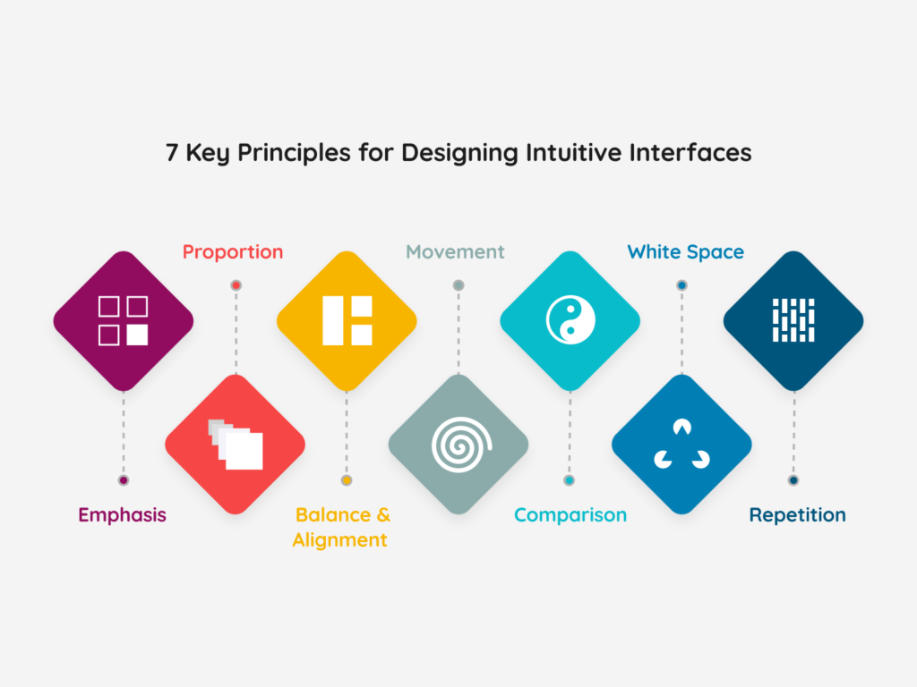
7 Key Principles for Designing Intuitive Interfaces

Principle of Emphasis
When designing a business workshop poster for email or other channels, remember the first of the 7 design principles: emphasis. This principle determines the focus and significance of each element in your design. Before you start, ask yourself: What key information does my audience need? Is it the date, location, or cost of attendance?
Once you have clarity, outline your ideas and let your creativity flow. Arrange your design in a visually pleasing manner. For instance, if the workshop name is crucial, make it stand out prominently. Use color theory to create an eye-catching palette that highlights the essential details.
Like writing, design requires structure and planning. Starting without a clear message can lead to a failed design. So, take a moment to gather your thoughts before diving in!
Principle of Balance and Alignment
In user design, every element you place on the page carries weight. This weight is influenced by color, size, and texture; cramming heavy icons into one corner can overwhelm users.
To achieve balance, consider using symmetrical design techniques, where elements of equal weight are aligned on either side of a central line. Alternatively, asymmetrical design can create interest through contrasting weights. Both approaches can effectively draw users’ attention and generate movement within your design.
Ultimately, balance is key. Whether you choose symmetrical or asymmetrical, both can be crafted to create a dynamic viewing experience.
Principle of Comparison
Design becomes memorable through comparisons that highlight contrasts. To make your design impactful, create brightness and contrast that harmonize the elements. Ensure the background tone complements the design colors.
However, if everything is bold, how do users identify what’s most important? The balance of size and weight creates clarity.
To craft a strong design, start with one or two bold, effective fonts. Avoid overloading your design with too many fonts, as simplicity enhances its purpose.
Principle of Repetition
While it might be tempting to use numerous typefaces and colors, it’s crucial to limit yourself. Stick to two solid typefaces or three colors, and embrace repetition. Repetition strengthens your design by creating a cohesive brand image across various platforms, from posters to social media.
Never underestimate the power of consistency. A unified brand image, complete with a consistent logo, is vital for successful design.
Principle of Proportion
Design is like a puzzle, where each piece contributes to a larger picture. Approach it in stages, considering the size and weight of elements and their relationships. Group related items together, such as buttons or sidebars, to create a cohesive layout.
Remember, proportion is essential. Achieving balance and clarity among all elements will lead you to the perfect scale.
Principle of Movement
Returning to our workshop poster, how can you ensure your audience focuses on the schedule first? Movement guides the eye from one important detail to the next, creating a clear narrative. Think of it as directing users from “The workshop is at this time and place” to “Here’s how to book a seat.”
While balance, alignment, and comparison are crucial, movement ensures your design remains engaging. If something feels off—like an oversized font or clashing colors—make adjustments to improve coherence.
Principle of White Space
White space, or negative space, is distinct from other design principles. While the others emphasize what to include, white space focuses on what to exclude. This absence creates balance and structure, significantly impacting user perception.
Far from an empty void, white space fosters visual interest and conveys a sense of luxury. Generously incorporating negative space allows your design to breathe, transforming it from average to exceptional.
Moreover, with creativity, negative space can convey multiple concepts or ideas simultaneously, enhancing your design’s impact. In summary, while white space may seem insignificant at first glance, it is a vital element that adds structure, balance, and elevates your content.
Conclusion
Creating the ideal user interface intuitively is both an art and a science. By adhering to essential UI design principles, you can achieve a harmonious blend of beauty and functionality.


