Negative space, or whitespace, is a vital component of effective web design. It refers to the areas surrounding and between elements, allowing designs to breathe and enhancing usability. By thoughtfully incorporating negative space, you can direct user attention, create a clear visual hierarchy, and improve overall user experience. This guide will explore practical strategies for utilizing negative space, showcasing inspiring examples that demonstrate its impact. Whether you’re a seasoned designer or just starting out, understanding and mastering negative space will elevate your designs and make your content more engaging and accessible. Dive in to discover the transformative power of whitespace!

An experienced designer knows how to leverage negative space to enhance the overall page design. Here are some tips that web design firms employ to create engaging websites through effective use of negative space.
Utilize Negative Space to Enhance Page Layout
Breaking up content is a key visual element in web design. Top design firms recognize that users need room to absorb information effectively. By incorporating negative space, you provide users the time to process what they see.
Negative space not only contributes to a modern, sleek aesthetic but also balances the overall composition. It highlights key visual elements, allowing for greater emphasis. Additionally, negative space guides the viewer’s attention, directing focus to specific areas by surrounding them with blank space. This creates a clear visual hierarchy, making it easier for users to scan the page and find what they need quickly.
Negative Space and SEO
Negative space also offers significant advantages for SEO (search engine optimization). Since search engine crawlers focus on text-based content for indexing, the strategic use of negative space allows designers to position keywords and phrases where they will be more prominent. This thoughtful placement enhances visibility for search engines, helping to drive organic traffic to the website. By combining effective design with SEO strategies, you can create a site that not only looks appealing but also performs well in search results.

Whitespace and User Experience
Moreover, effectively utilizing negative space can enhance user experience by streamlining the design and making content more digestible. By minimizing clutter on a webpage, users are less likely to feel overwhelmed and can concentrate on the essential elements, such as calls-to-action (CTAs) or key information about services and products. This clarity allows visitors to navigate the site more easily and engage with the content that matters most.
Negative Space and Branding
Lastly, negative space can effectively communicate brand messaging and values when applied consistently across various mediums, including websites, print materials, and social media. By skillfully utilizing surrounding space, you create harmony across these platforms, offering users a cohesive look and feel. This consistency not only reinforces brand recognition but also fosters loyalty among customers and potential leads.
Remember, Negative Doesn’t Mean White
While negative space is often white, it doesn’t have to be. You can incorporate other colors, patterns, or images as long as they don’t distract from the main elements.
Apple serves as a prime example of how effective use of negative space can enhance website design and reinforce brand messaging. Since the launch of the first iPhone in 2007, Apple has utilized whitespace in its user interfaces, which has been crucial to its success. Their minimalist approach highlights content by allowing ample empty space between elements, making it easier for users to scan the page and find essential information without feeling overwhelmed.

Apple’s Approach to Negative Space
Apple consistently applies its approach to negative space across all platforms, from web design to iOS apps to print materials. This strategy creates a cohesive look that enhances brand recognition and fosters customer loyalty. By effectively using negative space, Apple draws attention to key elements, such as product images and important text blocks about services or products.
Beyond improving usability and aesthetics, Apple also leverages negative space for SEO. By providing ample space around essential keywords and phrases, these elements become more visible to search engine crawlers, helping to drive organic traffic to the site.
Overall, Apple’s expert use of negative space serves as a benchmark for companies aiming to create modern, compelling websites while delivering a positive user experience. By harnessing this powerful design element, businesses can ensure their designs stand out and effectively reach their target audience.
Embrace Minimalism
Minimalism in whitespace has gained popularity in web design for its ability to reduce clutter and highlight the most important elements. Negative space lends a website a sleek, modern appearance while providing viewers with ample room to absorb the content. This approach enables designers to create a visual hierarchy that directs attention to key areas, such as important information or calls-to-action (CTAs).
Additionally, incorporating whitespace can enhance SEO, as search engine crawlers focus on text-based content for indexing. By strategically placing negative space, designers can make keywords and phrases more prominent, helping to boost organic traffic to the website.

Finally, whitespace doesn’t have to be strictly white; other colors or patterns can be employed as long as they don’t distract from the main elements. Subtle variations like these can enhance brand recognition and foster loyalty among customers and potential leads.
Micro and Macro White Space
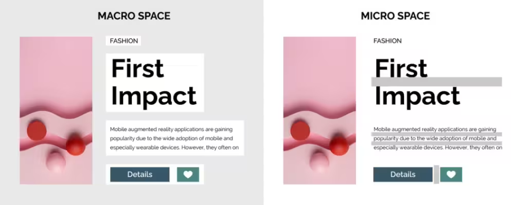
When incorporating negative space in web design, it’s essential for designers to understand the distinction between micro and macro white space. Micro white space refers to the small gaps between elements, such as letters, words, lines, and other design features. Paying attention to these details is crucial for creating an aesthetically pleasing layout that is easy for users to read and comprehend. For instance, increasing letter spacing can enhance text legibility, while more line spacing allows readers to scan the page quickly without feeling overwhelmed.
On the other hand, macro white space encompasses the larger gaps between significant elements on a webpage. This type of negative space conveys a sense of calm and order, helping viewers concentrate on specific content. Strategically using macro white space enables designers to establish visual hierarchies, guiding the viewer’s eye around the page and emphasizing key sections, such as calls-to-action (CTAs) or important text blocks, by surrounding them with ample blank space.

Balancing Negative and Positive Space
Negative space must always be balanced with positive (filled) space. Excessive negative space can make a design appear unfinished or dull, while too little can result in a cluttered and disorganized webpage that users struggle to navigate. By grasping how micro and macro white spaces interact, designers can craft visually appealing, functional, and informative layouts.
Conclusion
Negative space is a crucial element in web design and one of the most effective tools for enhancing user experience. By implementing the insights from top web design agencies, you can create a visually appealing website that resonates with viewers.


