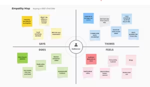
Companies such as Netflix, Airbnb, and Spotify leverage psychology-driven design to attract consumers. At its core, effective design hinges on understanding people and their challenges. For decades, product designers have harnessed these insights to create successful products.
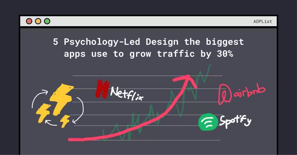
5 Psychological principles enhanced psychology and User Experience for Netflix, Spotify, and Airbnb
1. Give to Get (Users)
Reciprocity is the social norm where people feel compelled to return a favor. By providing users with valuable offerings—like free trials or personalized content—Netflix, Spotify, and Airbnb foster positive interactions, encouraging deeper engagement and loyalty.
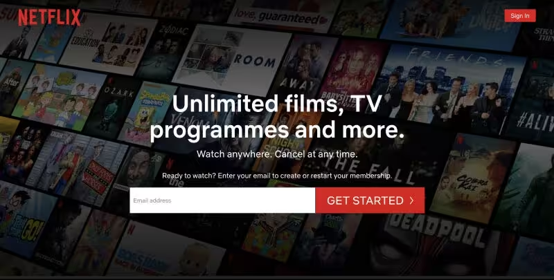
Landing Page — Netflix
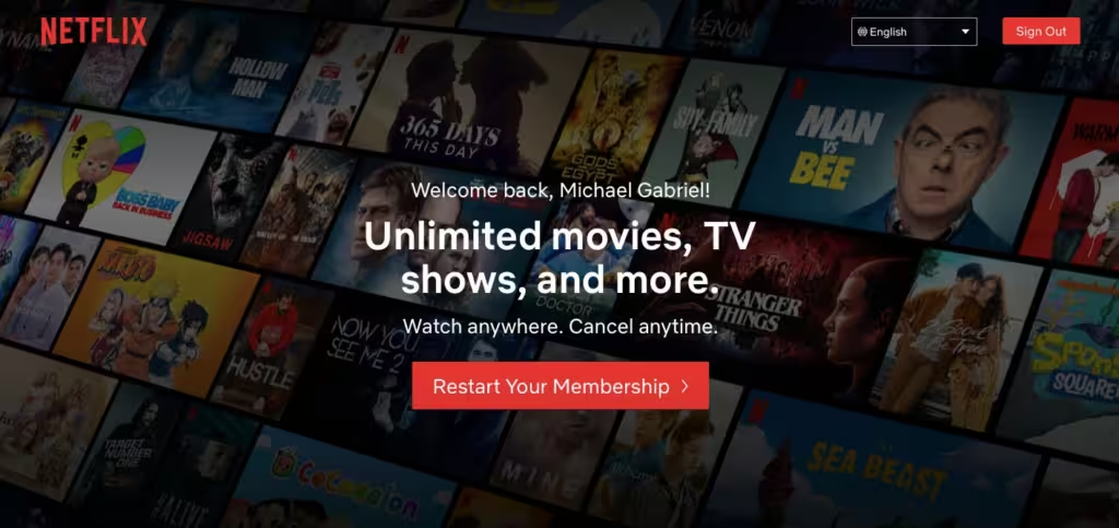
Netflix posed a question to its customers: “What’s the one thing you’d like to know more about before signing up?” The top response, from 46% of participants, was a desire to know about all the movies and TV shows available.
To address this, Netflix crafted an experiment featuring an image that suggested a vast catalog. By offering a glimpse without revealing everything, they increased the likelihood of customers signing up for a free streaming trial.
Superhost Guidance — Airbnb
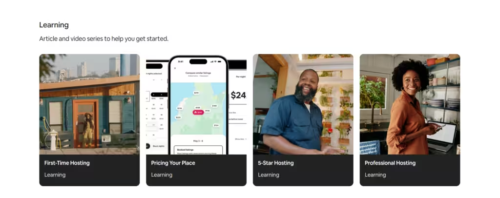
Airbnb leverages the reciprocity principle by educating hosts on how to provide an excellent experience for guests, while also guiding guests to respect house rules.
They offer tips on:
- Making homes more guest-friendly
- Surprising guests with thoughtful touches
- Sharing local recommendations for activities
This emphasis on mutual consideration results in:
Higher ratings > Higher ratings > Increased demand
As demand rises, hosts can charge more, benefiting both themselves and Airbnb.
2. Trigger Relevance
The Cocktail Party Effect states that people like to focus on information that’s relevant to them. It also proves that if we go deeper, relevant content can drive incredible results.
A New Home Page — Netflix
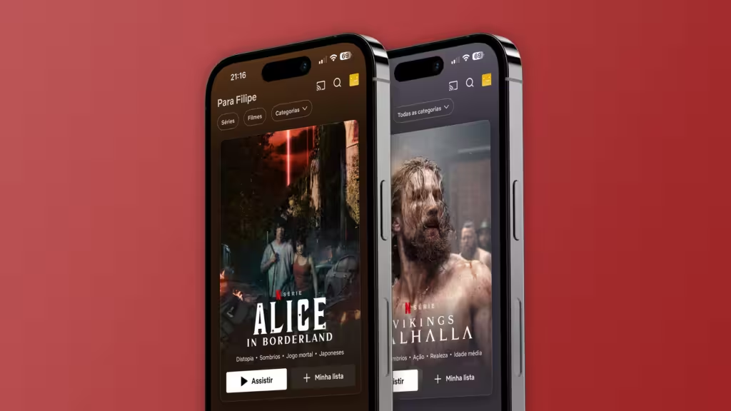
Netflix proudly identifies as “user-obsessed,” aiming to create a fully personalized experience for its subscribers.
Their “Because you watched…” category is a prime example of this philosophy in action as more than 80% of Netflix shows customers watched in the last two years have been a direct result of Netflix’s recommendation engine.
This level of personalization serves as a significant competitive advantage in both product and design.
Spotify Wrapped — Spotify
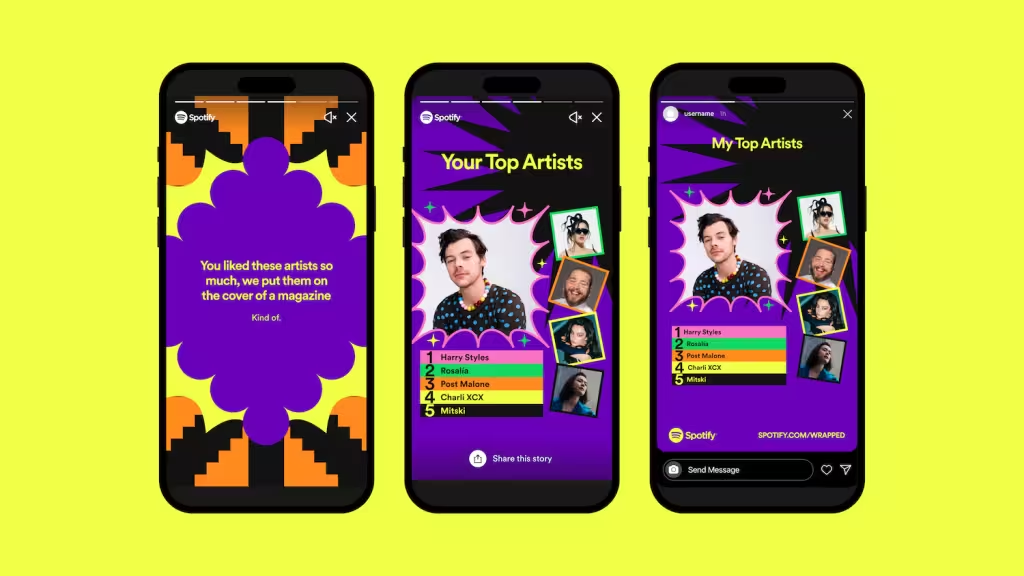
Spotify Wrapped is a standout example of effective personalization. It doesn’t just present data for the sake of it; instead, it centers on the users and highlights the elements of Spotify’s experience that they truly appreciate.
With Wrapped, Spotify subtly reminds us of how:
- We connect with the associations tied to our favorite music.
- We benefit from using the platform.
- It becomes part of our fond memories.
3. Keep Them Hooked
Recent studies in psychology, happiness, and customer experience have identified a principle known as “Idleness Aversion.” This principle suggests that people tend to feel happier when they are busy, even if that busyness is imposed upon them.
Autoplay Videos – Netflix
Netflix applies Idleness Aversion in an interesting way. Their experience forces you to watch trailers that auto-play when you dwell on the title.
This feature is a source of frustration for many customers, but the benefits of Idleness Aversion have clearly outweighed the costs for Netflix.
Spotify Wrapped (Again)— Spotify
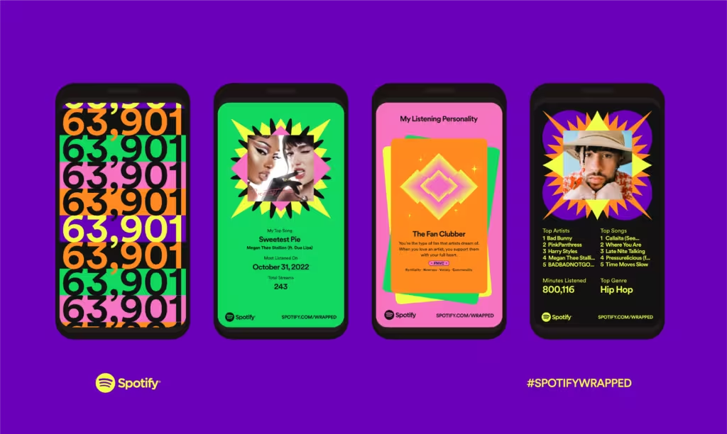
Since 2020, Wrapped has achieved a whole new level of gamification by adding literal games. All of these features are packaged in a way that is best suited to demonstrate your music engagement.
By showing listeners how they stack up compared to others — for example, by awarding “top 1%” status to the biggest listeners of a particular artist — they create a sense of:
- Exclusivity
- Social Status
- Social leadership
Although this has led some users to be more confused than pleased (Just like Netflix), but the popularity outweighs the confusion here as well.
4. Create Emotional Reactions
Designing for visceral reactions focuses on crafting a positive aesthetic impression. It involves understanding what people find visually pleasing and what they don’t, ensuring that the design elicits an immediate, favorable response.
Home Listings — Airbnb
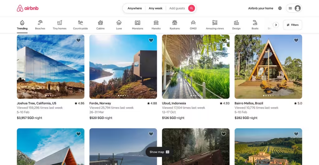
Airbnb employs visceral design to showcase the beauty and allure of travel. While many rentals may not feature beachside views or vibrant accommodations, Airbnb’s design effectively evokes a sense of excitement and possibility, connecting users to the adventure of exploring the world.
Recent Playlist — Spotify
Spotify applies visceral design principles across its platform to enhance user delight, such as through custom mixes based on users’ recent listening habits. The interface features minimal text and iconography, allowing artists, albums, and lyrics to take center stage.
Additionally, Spotify creates an immersive experience with video backgrounds and lyrics for select songs, further engaging users.
5. The Isolation Effect
If you want a user to remember something, make it stand out. Also known as “The Isolation Effect”, it states that users are more likely to remember an object if it is visually different.
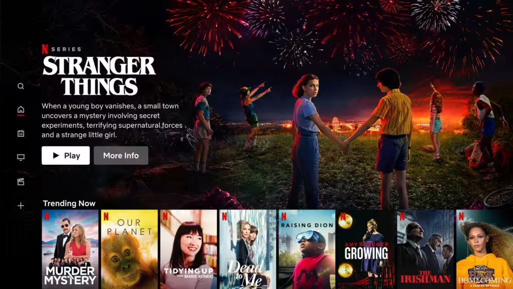
User Onboarding — Netflix
Netflix employs the Von Restorff Effect during user onboarding. When a new user arrives on the homepage, the prominent red button stands out among the other elements, drawing attention and encouraging clicks. Additionally, Netflix uses this effect to highlight “New Episodes” with a red tag, making them more noticeable and enticing.
Spotify Premium
Spotify takes a subtler approach to highlight its premium pricing. Rather than changing the color or shape of the premium option, they simply bold the text, effectively drawing attention without being overly conspicuous.
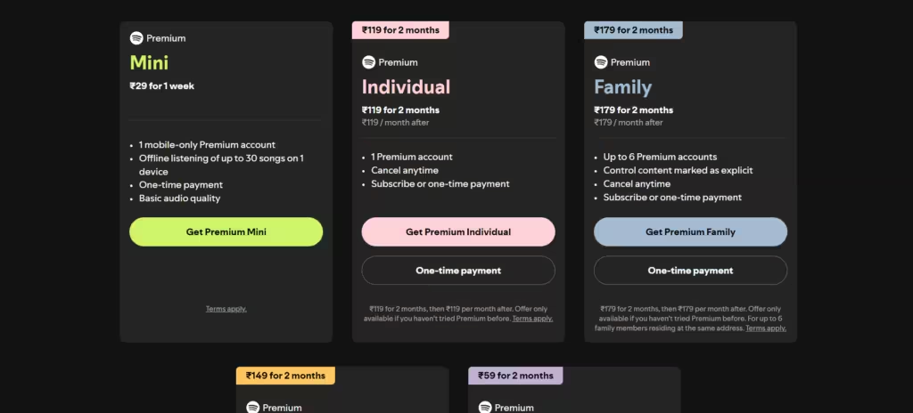
This strategy is effective because users are more likely to remember the additional benefits of premium rather than just the icon itself. However, it’s important to note that the Von Restorff effect emphasizes that standout elements are more memorable. This principle applies not only to UI elements but to the overall design of your app as well.