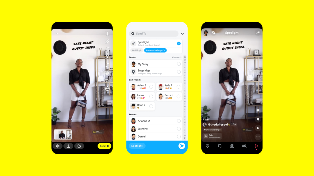
Snapchat’s usability has long been a challenge. They even included ten black-and-white diagrams in their IPO filing to help potential investors understand the app.
Many early websites and apps suffered from cluttered designs and distracting color schemes. So, how did Snapchat manage to succeed despite these hurdles?
Here’s how Snapchat defies design principles to create a successful product.
With over 500 million downloads on the Google Play Store and more than 160 million daily active users, Snapchat has captivated users despite its complex experience, which features:
- Confusing icons
- Lack of labels
- Hidden functionalities
- Complicated navigation without guidance
However, Snapchat’s user experience isn’t flawed; it’s a cleverly crafted design. This challenging experience keeps them relevant to their core audience: teenagers and millennials. Here’s how they achieve it:
1. Mastering User Psychology Through Gamification
Snapchat has tapped into user psychology by making certain features intentionally challenging to access. A prime example is the Streaks Count: as you send more messages and snaps to friends, you earn stickers for “best friends,” badges, and points, adding value to your friendships.
Additionally, there’s a built-in trophy system. Reaching specific milestones awards you a trophy—a badge you can showcase on your profile. This indicates your activity level and time spent in the app, serving as a status symbol that fosters a sense of superiority among users.
Every element is designed to encourage more interaction and keep users engaged longer. This effective gamification strategy has proven successful for Snapchat.

How to Gamify with the Most Popular Design Elements
To gamify a product effectively, the aim is to engage users and encourage ongoing participation: acquisition and retention. Here are some of the most popular design elements to consider:
- Rewards, Points, and Badges: Incentives, whether monetary or non-monetary, that motivate users to complete tasks.
- Leaderboards: Rankings that foster competition and trigger a dopamine response.
- Avatars: Allowing users to create a character adds a personal narrative to their experience.
- Gifting: Referral programs or campaigns that enhance user acquisition and retention.
- Challenges: Engaging missions and tasks that provide an adrenaline rush for users.
- Feedback: Interactive responses from the product that help users navigate and succeed in their experience.
2. Generating Excitement and Awareness with Challenging Features
In early 2018, Snapchat launched a major redesign that left many users confused and made accessing features more difficult. Initially targeting teenagers, the company shifted its focus to the broader market, willing to lose some of its “cool” factor to reach a wider audience.
Ultimately, this decision paid off. While teenagers still find Snapchat’s interface challenging, it transforms into a game for them, helping them feel cool and connected with their peers.
Whenever a new feature is introduced, users flock to discuss how it works, generating buzz and increasing awareness of Snapchat.
How to Master the Art of Hype with Challenging, Provocative Features
- Leverage the Scarcity Principle: Encourage desired actions by making your product or content harder to obtain. The rarer it is, the more valuable it becomes.
- Incorporate Exclusivity: Create a sense of FOMO (fear of missing out) among users. For example, Snapchat’s content expires either immediately or after 24 hours, prompting users to share more spontaneous and uncensored moments compared to other, more permanent platforms.
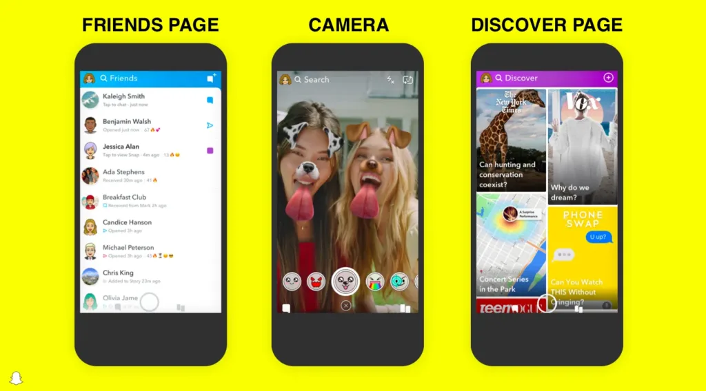
3. Challenging the Simplicity Rule with a Complex User Experience
They chose not to adopt universal icons, leaving many elements unlabeled, and the content discovery screen can feel a bit intimidating.
This approach created a more complex user experience, sacrificing some of their cool factor. Competitors are scaling up similar features, yet Snapchat’s immense success indicates that these UX choices haven’t harmed the platform.
In a landscape where users often abandon apps with complicated interfaces, Snapchat stands out. The key differentiator? Their target audience. This perplexing UX helps maintain Snapchat’s appeal among teens and millennials.
This demographic is both powerful and fickle; keeping Snapchat cool is essential. Nothing undermines that coolness faster than adult users, who typically won’t invest the time to learn the app, leading them to abandon it and ensuring Snapchat stays relevant primarily to younger users.
4. Snapchat elevated innovation with its unique design.
Snapchat prioritized experimentation over perfectionism. From its sharing features to interactive filters, the app captivates users right from the moment they open it with its innovative design.
For example, when you install and launch the app for the first time, it immediately draws you in. It opens directly to your front camera, and tapping the screen reveals the special effects menu at the bottom.
How Does Snapchat Excel in Innovation with Its Unique Design and Features?
- Mystery UX: Snapchat allows users to swipe in all four directions, revealing different app features. This unpredictability creates a thrilling experience as users never know what to expect.
- Instant Feedback: One standout feature of Snapchat is its prompt feedback system. When a user takes a screenshot of someone’s story, the creator is instantly notified, ensuring users feel their privacy is respected.
- Real-Time Prompts: When a user types a message, the recipient receives an immediate notification, like “Jimmy is typing a message…” This exemplifies effective real-time feedback.
- Super Easy: Snapchat simplifies sharing to other social media apps, a unique feature that Instagram later adopted. After taking a picture, you’ll frequently see the “Share,” “Edit,” and “Send” buttons for quick and easy sharing.
Netflix’s Auto Preview Feature: A Love-Hate Experience for Users
When it comes to user experience, Netflix generally excels, but one feature has left users divided: the auto-playing previews.
Netflix opted to auto play previews when users hover over thumbnails, a decision that frustrated many. Numerous articles, tweets, and blog posts have expressed complaints about this feature. Despite the backlash, four years later, the auto play is still in place, with Netflix only recently allowing users to opt-out manually in 2020 if they prefer not to have it.
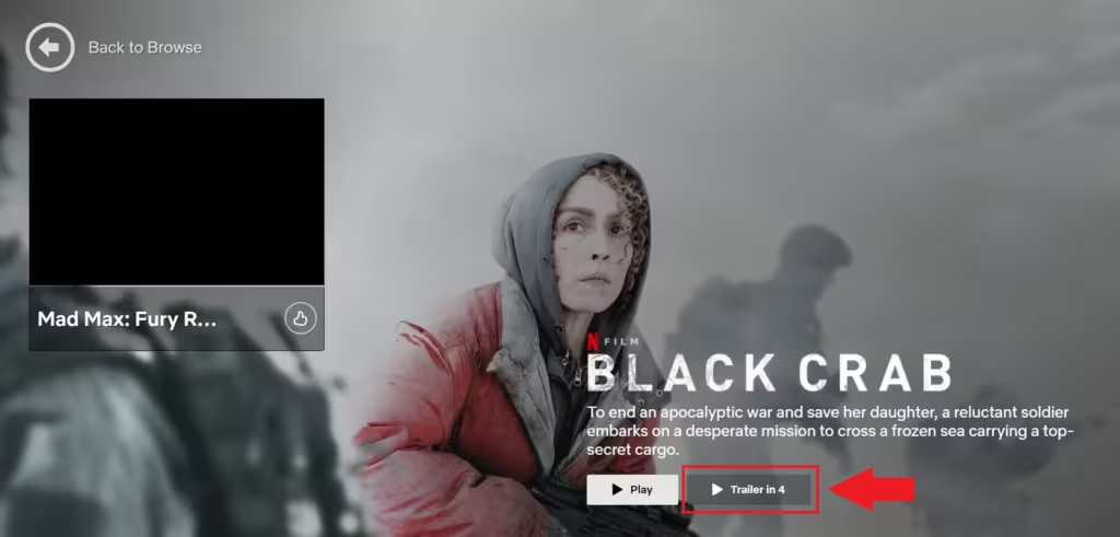
With the preview sound, additional music accompanies the trailers, perfectly matching the mood of the content. For horror films, you’ll hear unsettling screeches; for comedies, upbeat tunes; and for dramas, slow violins play in the background. While this may seem minor, it’s a crucial UX feature that significantly enhances the experience.
This innovative approach allows Netflix to convey the overall feel of a movie within seconds, giving users a sense of what to expect without even reading the description. By blending visual and audio cues, Netflix effectively communicates the emotional tone of each preview.
Conclusion
In conclusion, Netflix’s integration of sound with preview trailers plays a vital role in shaping user experience. By using music that aligns with the genre, they create an immediate emotional connection, helping viewers quickly gauge the tone of the content. This thoughtful combination of visual and auditory elements not only enhances user engagement but also streamlines the decision-making process, making it easier for users to choose what to watch. Ultimately, these innovative features reflect Netflix’s commitment to delivering a rich and immersive viewing experience.