Back in the early 2000s, I learned about low-energy web design when Google made its homepage dark for Earth Day. They said dark colors used less electricity than the usual white background. This idea interested eco-friendly designers like me. It even inspired other websites to follow suit. However, this was back when people still had big Cathode Ray Tube (CRT) monitors, if you remember those. Lets talk more about The Dark Side of Sustainable Web Design.

Afterward, many people began using Liquid Crystal Display (LCD) flat screen monitors and laptops with LCD screens, which were way more energy-efficient. Unlike CRT monitors, LCD screens have a single backlight that lights up the entire screen. This means that even if the screen displays a dark color, like black, the light stays fully on. So, the concept of dark web design saving energy became outdated and was largely forgotten for about a decade.
The Era of LED Screens
Recently, screen technology has evolved, with many new devices adopting OLED technology. OLED stands for Organic Light-Emitting Diode. Essentially, it’s a film with diodes that emit light on their own. Despite the name “organic,” they’re not Soil Association Certified. “Organic” simply refers to being made from a carbon-based material.
One significant difference with OLED screens is that instead of having a single backlight, each pixel is a tiny LED lightbulb that illuminates individually when needed. This results in better picture quality and less electricity used for dark colors because fewer pixels are lit up.
With the introduction of OLED technology, using dark colors in web design to reduce energy consumption suddenly makes sense again.
Another significant change since Google introduced its dark theme in the early 2000s is the rise of smartphones and mobile devices. Before the launch of the iPhone in 2007, the digital world was quite different.
Power consumption is even more critical for mobile devices because it directly affects battery life. Therefore, reducing screen energy not only benefits the environment but also improves the practicality for end users. OLED screens not only use less energy but can also help batteries last longer when dark backgrounds are used.
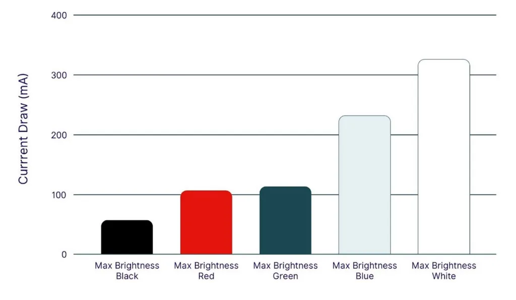
Google discovered that the Google Maps mobile app can consume up to 63% less screen energy in night mode compared to standard mode on phones with OLED screens.
Interestingly, they also found that while white pixels use the most energy, blue pixels use considerably more than red and green. So, the colors we choose in our designs now matter not just for branding, user experience, and accessibility but also for the environment and mobile battery life.
I made a rough estimate considering the overall energy consumption of a website, including data centers, transmission networks, and CPU energy on the user’s device. Based on this, I concluded that a design with a dark background could potentially save around 10% of total energy compared to a design with a white background, specifically on OLED screens.
Embracing the dark side Dark Side of Sustainable Web Design
Amidst the escalating climate crisis, conserving energy has become more crucial than ever. Transitioning websites from standard white backgrounds to darker tones can significantly benefit the environment.
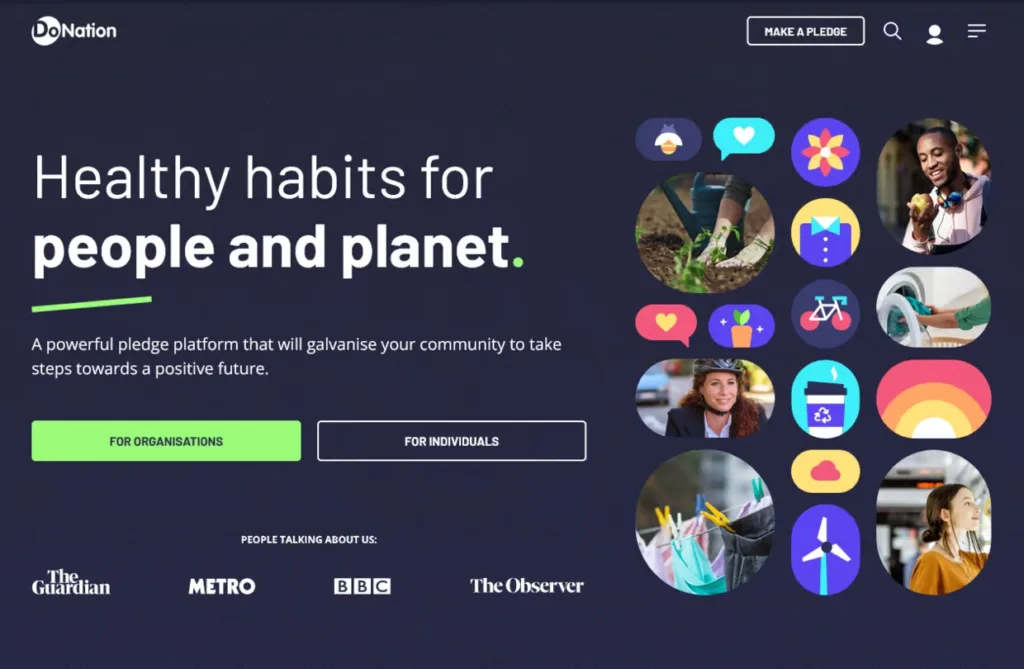
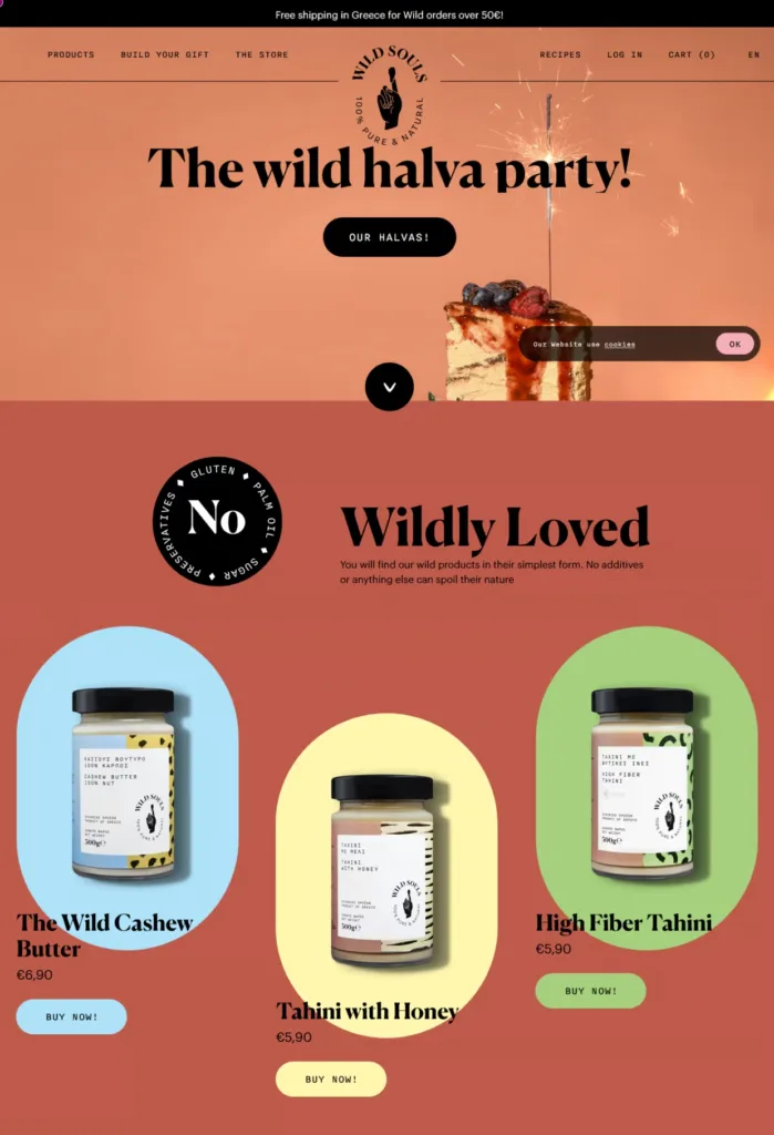
Below are a few examples of websites that have effectively embraced darker color palettes:

Are Dark Websites Accessible? let’s find out
In my exploration of design with darker colors, I’ve discovered an interesting trend: while some people prefer reading on light-colored backgrounds, others lean towards dark backgrounds. This observation is supported by a review from Nielsen Norman, which concluded that individuals with normal or corrected vision generally perform better with light mode. However, those with conditions like cataracts may benefit from dark mode. On the flip side, prolonged reading in light mode might be linked to myopia.
Also read about after finishing this Sustainable Web Design – The Dark Side – 5 Eco-Friendly Fonts for Sustainable Web Design
This suggests that, on average, dark text on light backgrounds is easier to read. However, it also underscores the fact that there isn’t always a perfect, one-size-fits-all solution to design challenges. Therefore, it’s crucial to carefully consider the target audience in each case and strive to create designs that strike a balance between high color contrast and low eye strain—the Goldilocks combination.