Learn to create website footer that elevate user experience and streamline navigation. Check out best practices and examples for crafting impactful, functional footers.
Key Elements of an Effective Footer
When designing a website, it’s important to consider several essential elements for creating a footer that adds value. An effective footer not only enhances the site’s visual appeal but also improves usability and user interaction. A thoughtfully designed footer can greatly boost user engagement. Here are the key elements to focus on:
- Contact Information
- Navigation Links
- Social Media Icons
- Copyright Notice
- Privacy Policy and Terms of Service Links
Best Practices for Footer Design
When designing a footer, it’s crucial to focus on both aesthetics and usability. To achieve this effectively, here are some key principles to keep in mind:
Keep It Simple and Organized
An easy-to-navigate footer helps users quickly find the information they need. Organize headings and sections strategically to avoid overwhelming visitors with too much content or too many links.
Ensure Mobile Responsiveness
With more users accessing websites on mobile devices, it’s vital to design your footer for all screen sizes, including smaller phones. Make sure every button and link is clickable and that text remains readable.
Use Consistent Branding
The footer should reflect your brand identity through consistent use of colors, fonts, and logos. This alignment enhances the overall appeal of the website and strengthens brand identity among visitors.
Optimizing Your Website Footer for SEO and User Experience
Optimizing your website footer is essential for enhancing both search engine visibility and overall user experience. Here are some tips to help you achieve this:
Footer Links for SEO
Effective footer links can boost your website’s SEO. Consider these strategies:
- Use Descriptive Anchor Text: Ensure your footer link text clearly describes the linked content. This helps search engines understand what the page is about.
- Incorporate Relevant Keywords: Include relevant keywords in your footer links to enhance SEO. This signals to search engines the relevance of your content to specific queries.
- Utilize Internal Linking: Link to other pertinent pages on your site within the footer. Internal links help search engines crawl and index your site more effectively, improving overall SEO.
- Avoid Over-Linking: While it’s important to provide useful links, refrain from overcrowding your footer. Too many links can seem spammy to search engines and overwhelm users.
Improving User Experience
Enhancing the user experience in your footer can lead to greater engagement and higher conversion rates. Here are some tips:
- Simplify Navigation: Include clear, concise navigation links to help users easily find what they need, improving overall site usability.
- Provide Contact Information: Make it easy for users to reach out by including contact details, such as phone numbers and email addresses, in your footer. This fosters trust and encourages user interaction.
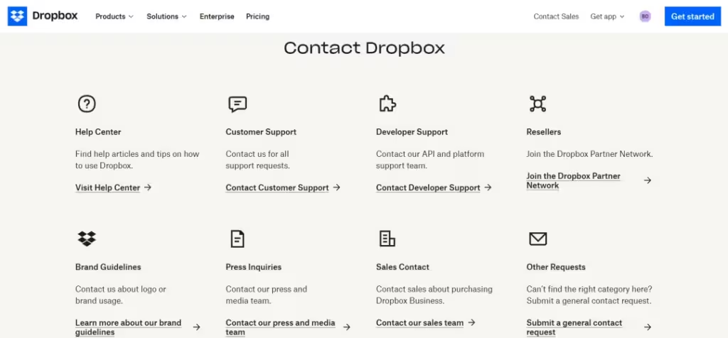
Include Social Media Links
Incorporate social media links in your footer to enable users to connect with you across different platforms. This helps foster a community around your brand and boosts user engagement.
Maintain a Clear and Concise Design
Ensure your footer design is clean and easy to read. Avoid clutter and use a straightforward layout to help users quickly find the information they need.
By implementing these tips, you can optimize your website footer for both SEO and user experience, ultimately enhancing your site’s performance and user satisfaction.
Effective Footer Designs Examples
Often overlooked, footers are vital elements of a website that aid navigation and subscriptions. Here are some exemplary websites that showcase outstanding footer designs:
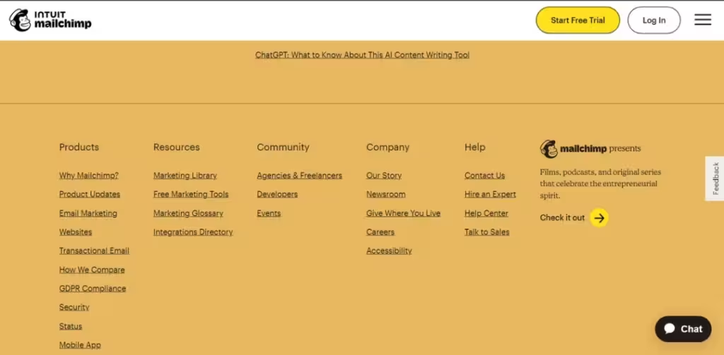
1. Mailchimp
Mailchimp’s footer creatively blends visuals and essential info, featuring organized navigation, social media, and legal sections. Its vibrant colors guide user attention effectively.
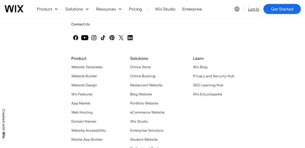
2. Wix
Wix features a simple yet effective footer design that stands out. It highlights essential sections like navigation and subscriptions, enhancing usability and user satisfaction on lengthy pages.
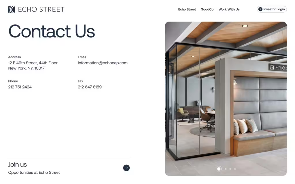
3. Echo Street
Echo Street created a modern website for an asset management firm, featuring a simple footer for easy connections and showcasing the team to build user confidence.
Conclusion
In conclusion, a well-designed footer enhances user interaction on your site. By avoiding common mistakes and implementing best practices, you can create a footer that not only guides users but also promotes your brand.
Regular testing and updates based on user feedback are essential to maintain its effectiveness. We encourage you to apply the insights and strategies shared here to craft a footer that improves navigation, minimizes user search time, and directs visitors seamlessly without drastically changing the site layout.


