Figma is incredible! It streamlines the integration of UI kits and design systems into your workflow with ease. You’re not limited to just Figma’s native features; the platform encourages exploration, growth, and the joy of collaborative design.
Each month, countless new Figma UI kits and design systems are released. To identify the top-quality design systems, we reviewed hundreds of these kits.
1. Ant Design
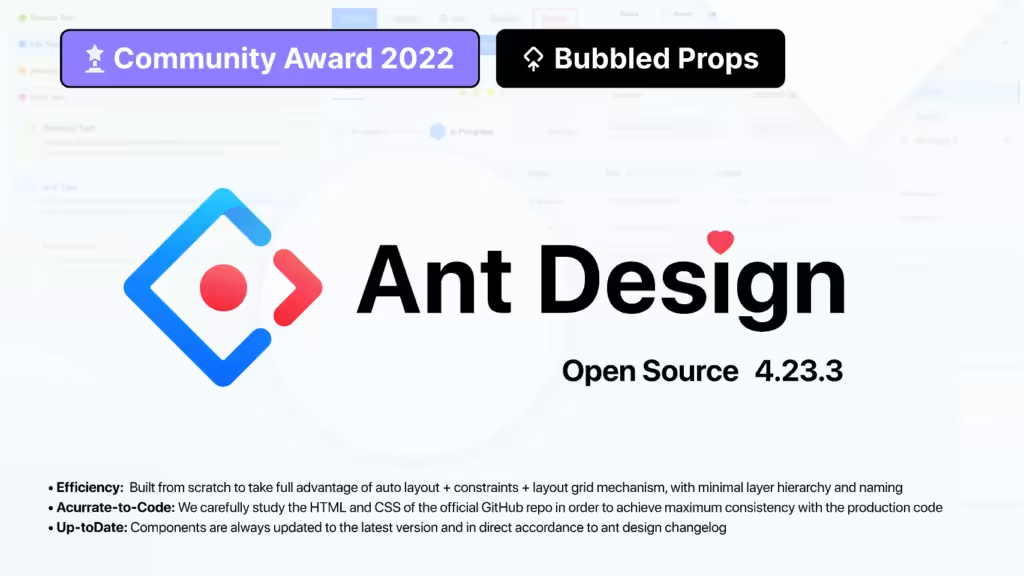
Ant Design is a Figma UI kit that provides everything you need, featuring a wide range of components and styles. Its organized library is designed to prevent misunderstandings between teams, making it a valuable tool that significantly boosts designers’ productivity.
2.Airtable
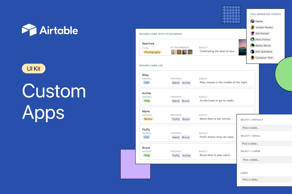
Using the same UI kit that the Airtable team employs internally, you can build your own app with the Airtable Apps UI Kit. On top of Airtable, you can develop unique applications with Custom Apps and the Blocks SDK.
3. Atlassian
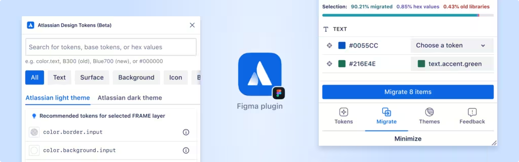
You can design your own Atlassian and Jira interfaces using a wide array of components from the well-established Atlassian design system, which is split into two parts. This design system offers a professional look and is incredibly user-friendly.
4. Base Design System By Uber

This impressive and free design system from Uber was created as a “foundation” for building other design systems. Although still relatively new, it is well-regarded for its Figma component library and React implementation.
5. Pegasus Design System
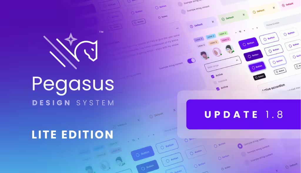
The Pegasus Design System is a reliable Figma design system featuring over 2,000 components, 100+ styles, and transport kit designs, all designed to facilitate scalable design.
6. Design Encyclopedia
The Design Encyclopedia, the largest Figma design system globally, provides hundreds of UI elements, styles, and page templates for users to explore. Its standout feature is its focus on charts and interaction patterns.
7. Shopify Design System
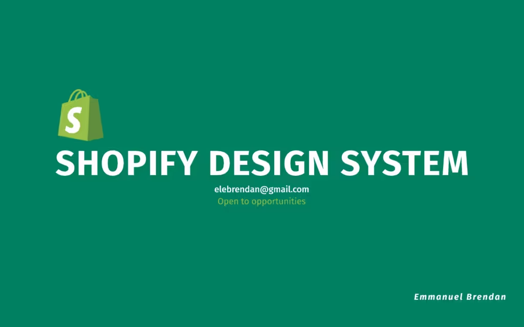
The Shopify Design System is essential for anyone involved in e-commerce, whether at a company or a small enterprise.
For those new to Figma or Shopify, the Figma Onboarding prototype file is a great resource to quickly get up to speed, as Figma is Shopify’s preferred tool for product design and prototyping.
8. Primer by Github
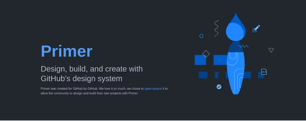
Primer was developed by GitHub for GitHub and later released as an open-source design system. This allows the community to leverage Primer for designing and building their own projects.
9. Layers Design System
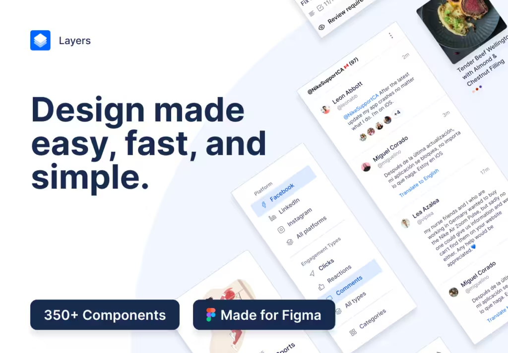
This accessibility-first design system is a Figma UI kit that features over 350 components, along with example products and blocks, making it a robust resource for designers.
10. Backstage

Create your own Backstage plugin using this Figma UI kit.